A Fresh Start: Introducing the Forum for Youth Investment’s Refreshed Brand
March 27, 2024
Change is inevitable, and as organizations evolve, their outward appearance needs to reflect their internal growth. At the Forum for Youth Investment, we fully embrace this dynamic. Today, we’re excited to unveil a bold step forward—a brand refresh that reflects our internal growth and commitment to clarity and rejuvenation.
The Forum for Youth Investment is transforming systems, spurring innovation, and partnering for results that improve outcomes for youth and encourage them to unleash their full potential. Central to our mission is a steadfast commitment to ensuring that every young person, regardless of their background or circumstances, has the opportunities and support to thrive.
Join us as we sit down with Amanda Heckenkamp, the Forum’s communications manager, to learn more about what to expect from our brand refresh.
Forum for Youth Investment: What motivated the decision to refresh the brand?
Amanda Heckenkamp: When developing and beginning to implement our first five-year strategic plan, we needed to be clear about what we do, who we do it for, and how we communicate it. We also know how important it is to prioritize accessibility while modernizing to stay relevant and achieve the greatest impact. The brand refresh emerged as a key next step to signify this new direction for the Forum.
Forum: How does the new brand identity reflect the Forum’s values and mission?
Amanda: Our visual brand identity is a powerful embodiment of the Forum’s mission. It captures attention, communicates our values, and fosters recognition. With a focus on clarity, we’ve incorporated new design elements to convey the essence of our work. This thoughtful approach aims to engage our current cross-sector audience and attract new stakeholders.
Forum: What changes were made to the visual identity (logo, color palette, etc.) and why?
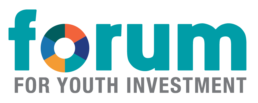
Amanda: We’ve updated our logo to build on the Forum’s visual legacy, enhancing its strengths while adding a fresh appeal. The ‘O’ incorporates multiple colors from our palette, symbolizing our collaborative approach and resembling a donut chart to reflect our commitment to data-driven results. We updated our color palette to improve accessibility and maintain consistency with our previous brand colors. The new font complements the logo, offering simplicity and versatility for design. Additionally, we’ve introduced a pattern to our visual elements, adding texture to symbolize our cross-collaborative work and the multiple entities that come together to inform our initiatives.
Forum: How does the brand refresh fit the organization’s long-term strategic goals?
Amanda: Our brand refresh is more than a visual change; it’s deeply connected to the goals outlined in our strategic plan and our vision that all young people reach their fullest potential. Our goal throughout has been to reach broader audiences and resonate more deeply with diverse communities; reflect a forward-thinking approach that signals our ability to evolve and innovate; reposition ourselves as thought leaders and reinforce our reputation as a trusted resource; and, importantly, emphasize our strategic focus on collaboration and partnership to build stronger systems that support young people to thrive.
Forum: What message would you like customers, partners, and stakeholders to take away from this brand refresh?
Amanda: We want our customers, partners, and stakeholders to recognize that this brand refresh signifies more than just a visual update; it reflects our commitment to progress, collaboration, and innovation. This evolution demonstrates our ongoing efforts to adapt to changing needs and strengthen our role as trusted leaders in youth development. Ultimately, we hope this refresh inspires confidence in our mission, deepens connections, and reaffirms our dedication to building a brighter future for all young people.
Watch our brand video:
At the Forum for Youth Investment, we're transforming systems, spurring innovation, and partnering for results that improve outcomes for youth and encourage them to unleash their full potential. We're proud to unveil a new chapter: rediscover who we are, renewed and refreshed.
